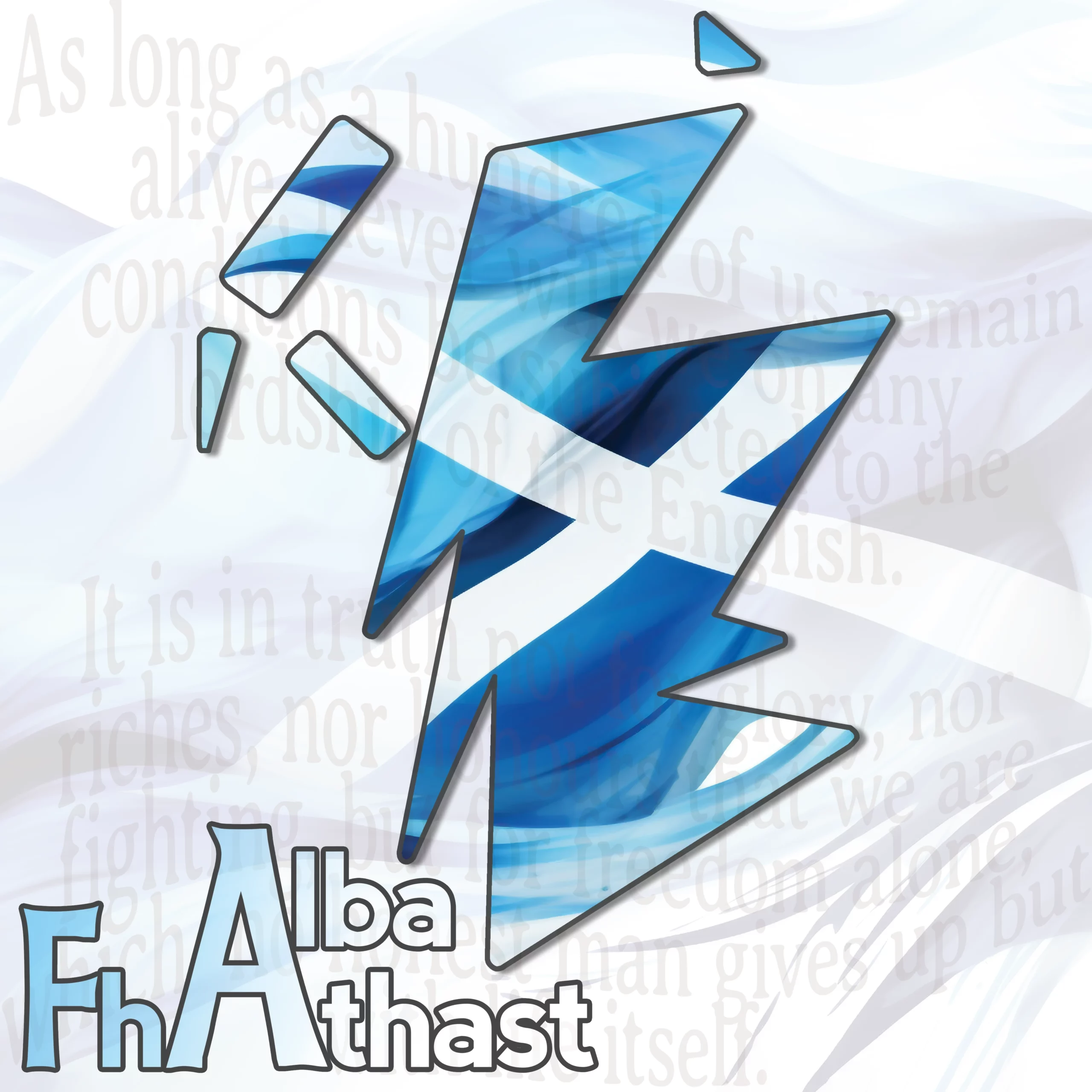
I’ve been playing around with this log off and on for the last day or two. The original idea in my head was a stylized outline of Scotland giving it a modern feel. I don’t claim that this concept is particularly original in and of itself, I’ve seen similar ideas executed for at least the last 40 years and probably longer. Hopefully my particular interpretation is new though.
I loaded a standard map of Scotland in Photoshop and then drew some deliberately basic outlines around it. The goal was to have something that immediately looked like Scotland to anyone familiar with the country, but with only the most minimal elements to make it up. To that effect, for the various islands around Scotland I just used triangles and rectangles. Once I was done with that though, it just looked too sharp and angular so I worked with it in Photoshop to round off all the edges until the shape was pleasing to my eye.

And that was where my original conception ended. I filled it with a dark shade of blue and gave it a black border, but it just looked very… plain. Suitable for an embroidered logo on a shirt maybe but not very interesting as a large image in its own right. So I started to play around.

The first thing I did was throw a few prompts into MidJourney. I wanted a Saltire waving in the breeze that I could use instead of the plain blue in my original logo. But that didn’t quite work so I prompted for something a bit more artistic which gave me this rather lovely imagery. It took a little tweaking and resizing but I was able to mask that image so the flag only appeared inside the outline of Scotland. But then I just had this giant white space all around it. So then I added the Alba Fhathast logo, but my previous logo didn’t look right next to this modern map, so I modernized my logo with some new font choices.
Now, any sane person would have stopped at this point having achieved their goal, but I just had to keep fiddling. Next up I realized I could extend the flag background, toned down and almost translucent, across the rest of the white space so that the viewers eye could follow. Then as a final touch I added some text from the Declaration of Arbroath (again faint) to the background, because you don’t get much more Scottish than that.
The end result, I think, is a pleasing to the eye melding of old and new elements.
Discover more from Alba Fhathast
Subscribe to get the latest posts sent to your email.